

Client:
YouMRI
YouMRI
Tasks:
Brand strategy
Brand identity
Product UX/UI
Website Design
Brand identity
Product UX/UI
Website Design
From MRI to the future of medical education.
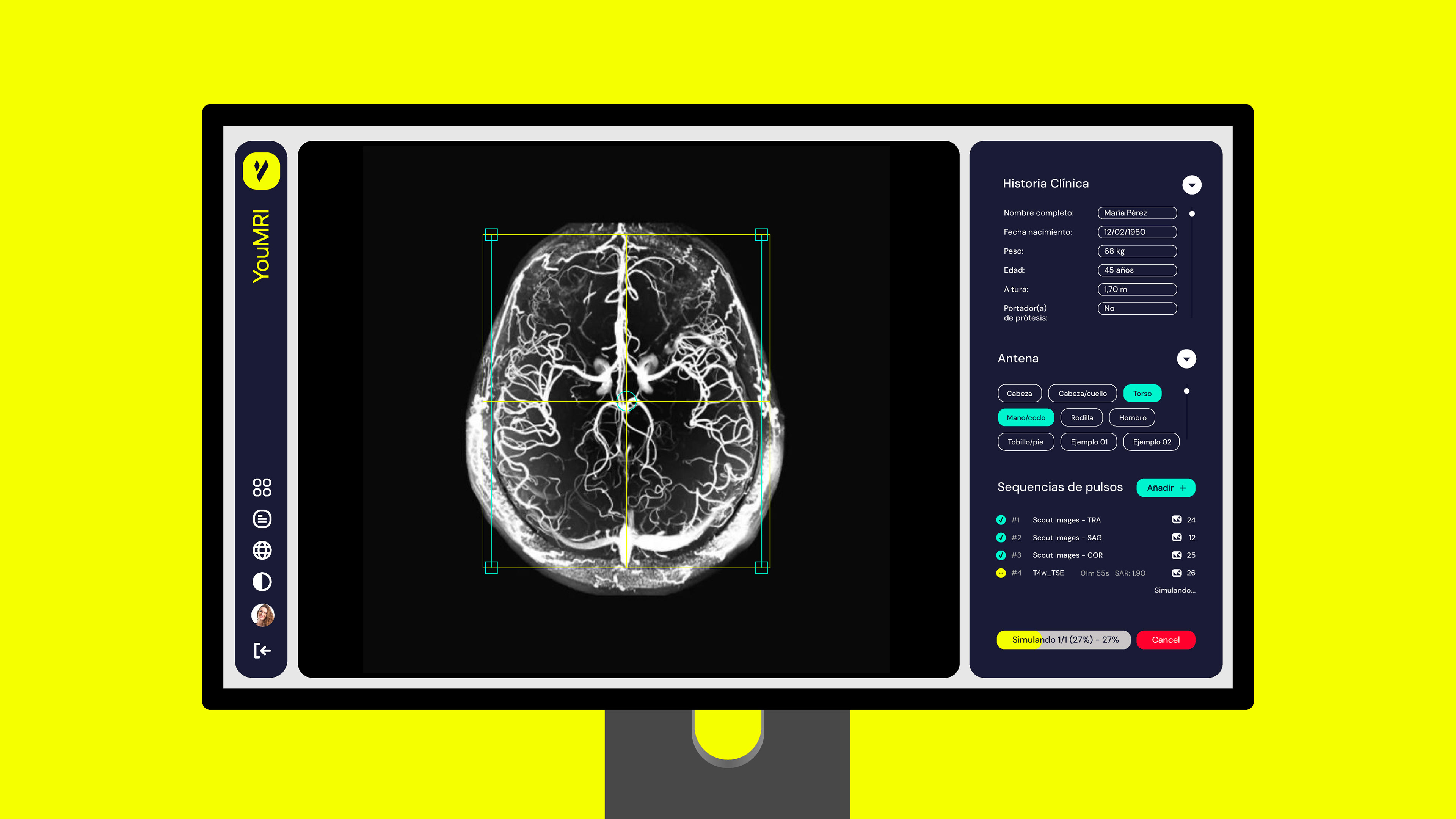
YouMRI is transforming medical education by making MRI training accessible from any computer or tablet, anywhere in the world.
Students no longer need to travel to a hospital or wait for access to a physical scanner to practise: they can explore and learn from a realistic MRI environment directly through the platform.
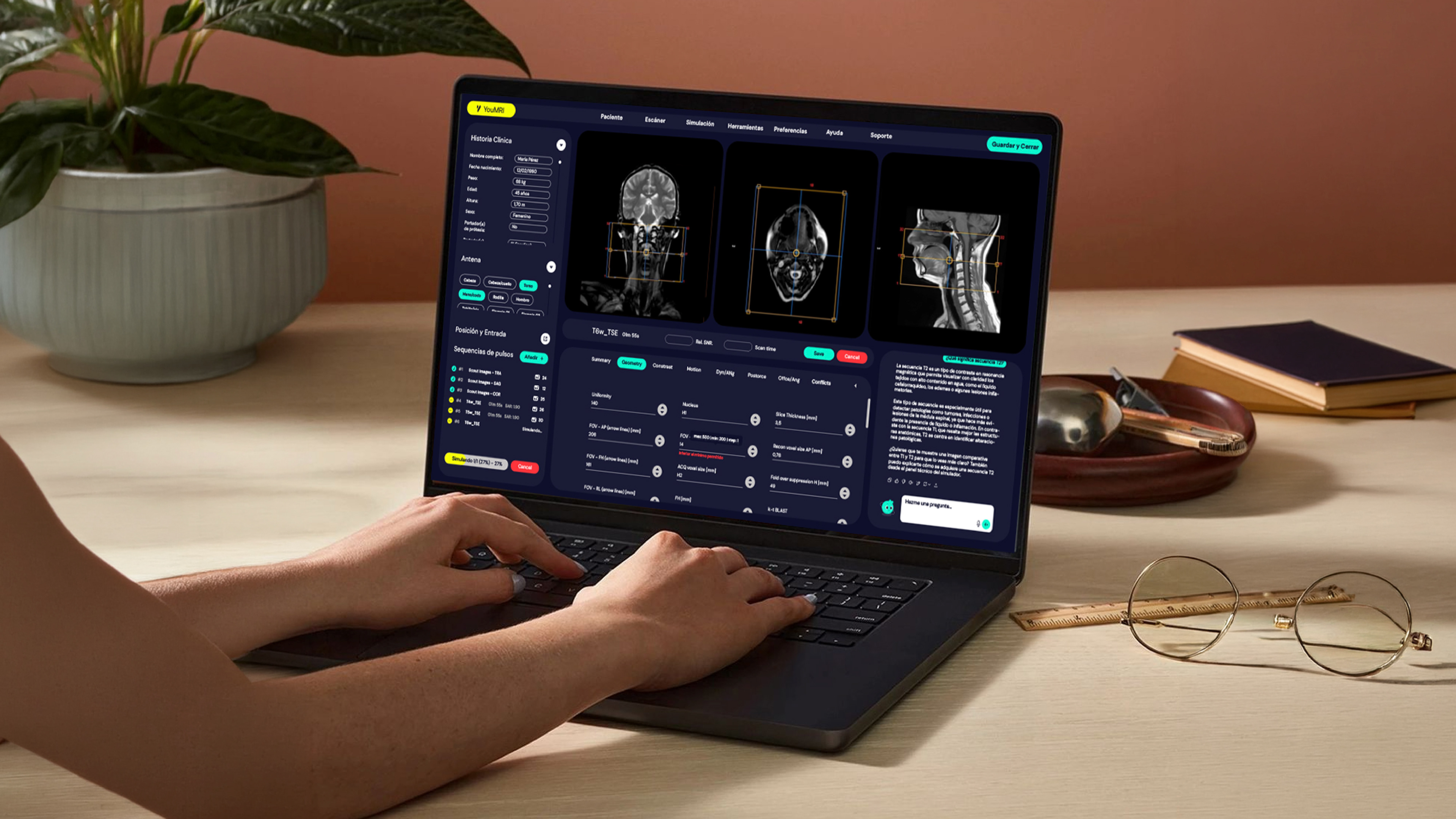
My role was to rethink the entire experience from the ground up. I developed the brand strategy and visual identity, redesigned the UX/UI of the learning platform, and created the new website to bring the project together. The challenge was to translate the complexity of an MRI scanner and its clinical workflows into an interface that feels clear, intuitive and accessible, without losing the depth and precision required for medical education.
This meant designing more than a visual system: I helped reinvent how students interact with MRI technology, turning a traditionally hospital-based learning process into a flexible, scalable and globally accessible digital experience.
Students no longer need to travel to a hospital or wait for access to a physical scanner to practise: they can explore and learn from a realistic MRI environment directly through the platform.
My role was to rethink the entire experience from the ground up. I developed the brand strategy and visual identity, redesigned the UX/UI of the learning platform, and created the new website to bring the project together. The challenge was to translate the complexity of an MRI scanner and its clinical workflows into an interface that feels clear, intuitive and accessible, without losing the depth and precision required for medical education.
This meant designing more than a visual system: I helped reinvent how students interact with MRI technology, turning a traditionally hospital-based learning process into a flexible, scalable and globally accessible digital experience.
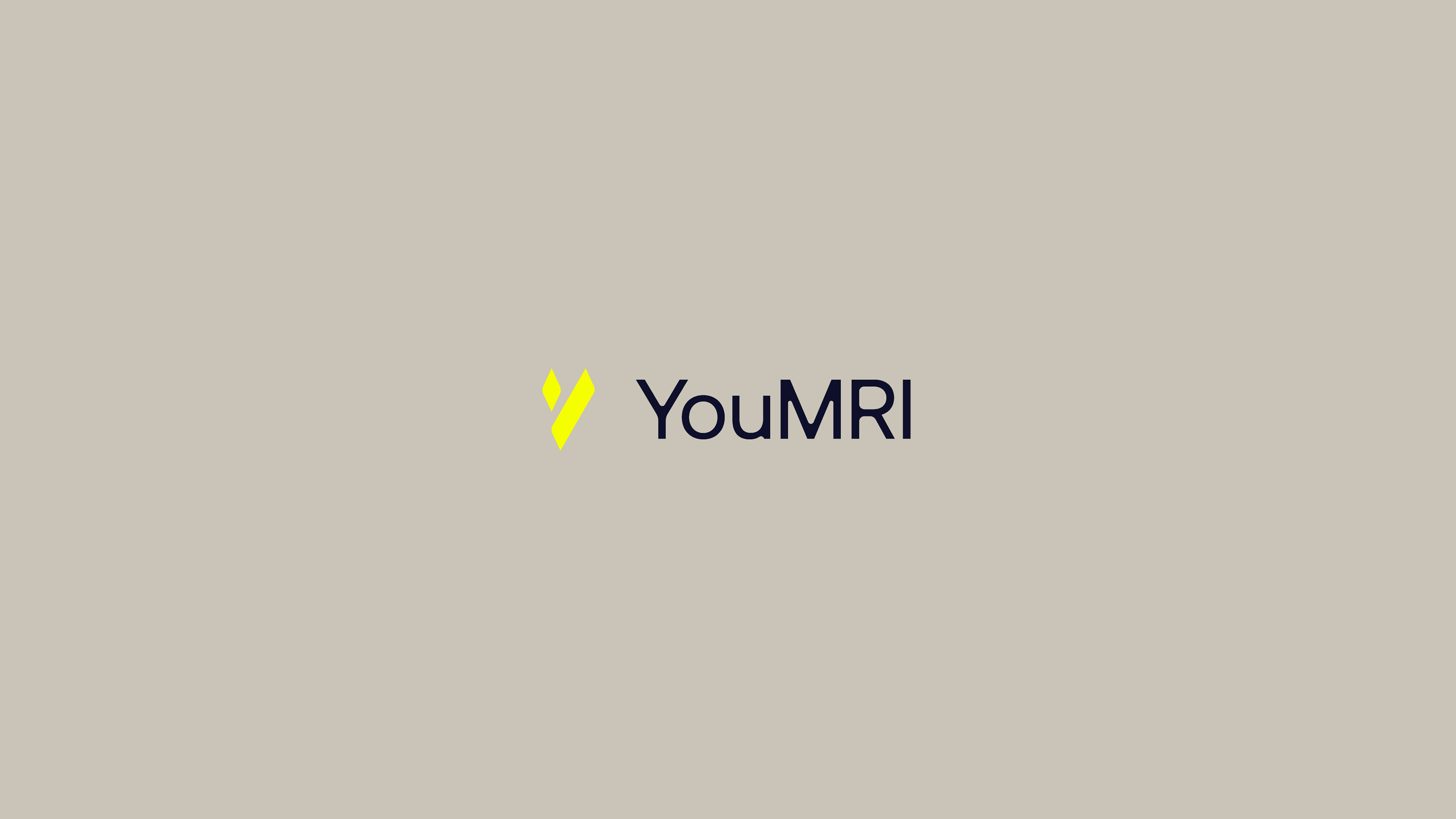
The logo is built around the initial “Y”, reimagined through two simple shapes that become the foundation of the entire visual identity. This flexible graphic element creates a distinctive and recognisable language that can evolve across the digital experience.
-
The visual style is fresh, bold and youthful, balancing two different audiences: university and hospital decision-makers on one side, and students who need to engage with and enjoy the product on the other.

-
The colour palette follows the same approach: vibrant, energetic and impactful.
The brief was to deliberately move away from the predictable blues and greens commonly used by competitors, giving YouMRI a more distinctive and contemporary presence within the medical technology space.
The brief was to deliberately move away from the predictable blues and greens commonly used by competitors, giving YouMRI a more distinctive and contemporary presence within the medical technology space.

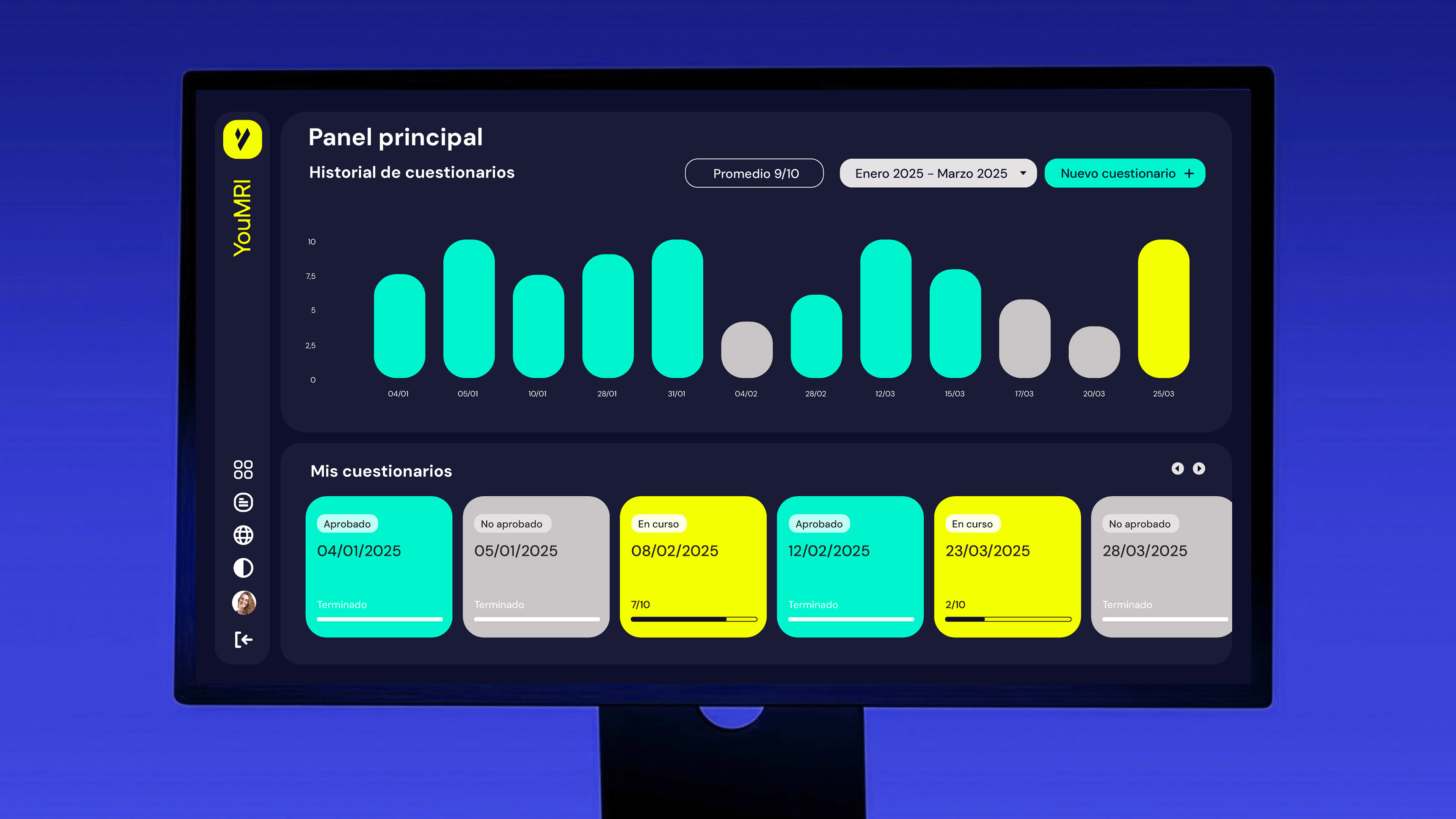
To achieve this, we worked side by side with a large team of medical, technical and industry professionals. Their expertise helped us translate real-world procedures, terminology and decision-making processes into a digital environment that feels credible and engaging. Every detail was carefully considered to make the simulator as close to the real thing as possible, while preserving the flexibility and usability of a digital learning tool.
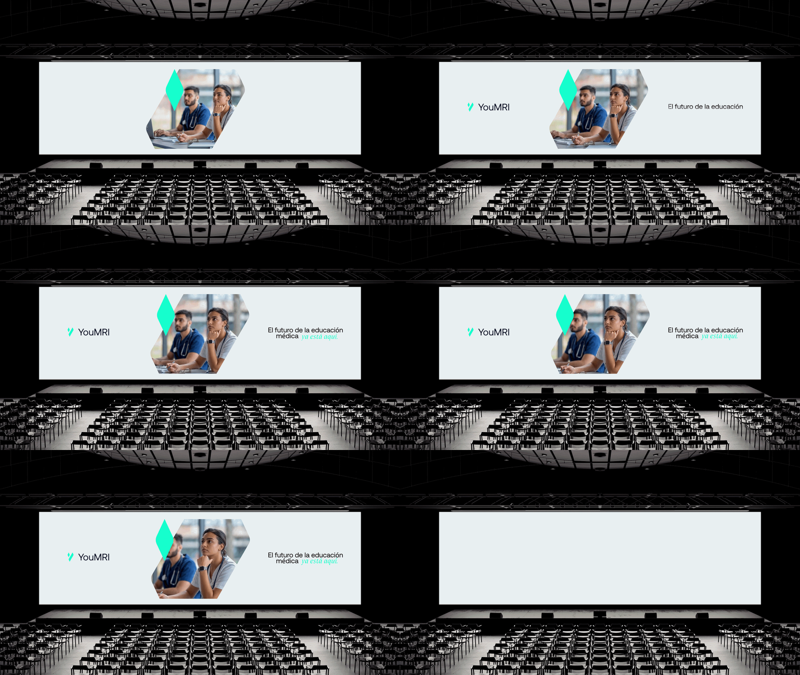
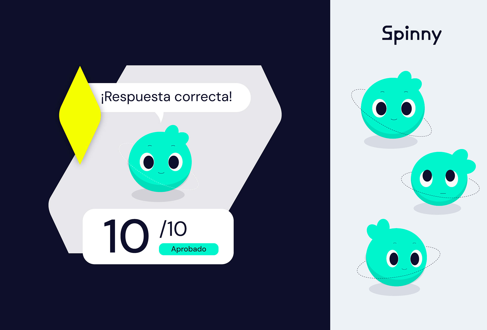
Meet Spinny: YouMRI’s playful side. A friendly mascot designed to bring personality and warmth to a highly technical product.
Fun and approachable without becoming childish, Spinny helps make the experience more engaging for students while keeping the overall brand professional and credible.
Fun and approachable without becoming childish, Spinny helps make the experience more engaging for students while keeping the overall brand professional and credible.
Thanks Cinta, and thanks to the whole team for your trust!