


Client:
Digistart
Digistart
Tasks:
Brand Strategy
Brand Identity
Brand Identity
No magic. Just method.
Quality Web knows that performance doesn’t happen by chance. It comes from understanding the business, reading the data and making the right decisions, combining rigorous strategy with the creativity needed to make brands stand out.
My role was to turn this mindset into a visual identity: a distinctive logo, a bold colour system and a dynamic graphic language designed to make Quality Web look as sharp, confident and energetic as the work they do.
My role was to turn this mindset into a visual identity: a distinctive logo, a bold colour system and a dynamic graphic language designed to make Quality Web look as sharp, confident and energetic as the work they do.


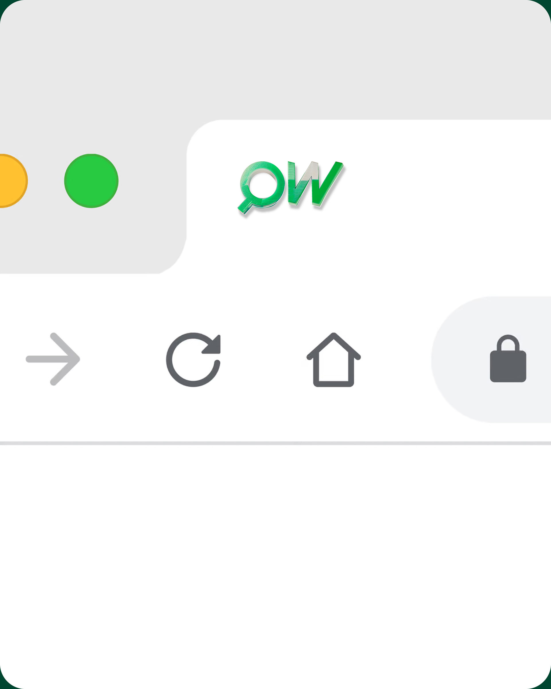
The Q becomes a lens: a visual metaphor for the way Quality Web looks deeper into every business, market and opportunity.
The W subtly echoes the upward movement of charts, connecting insight with measurable growth.
The W subtly echoes the upward movement of charts, connecting insight with measurable growth.
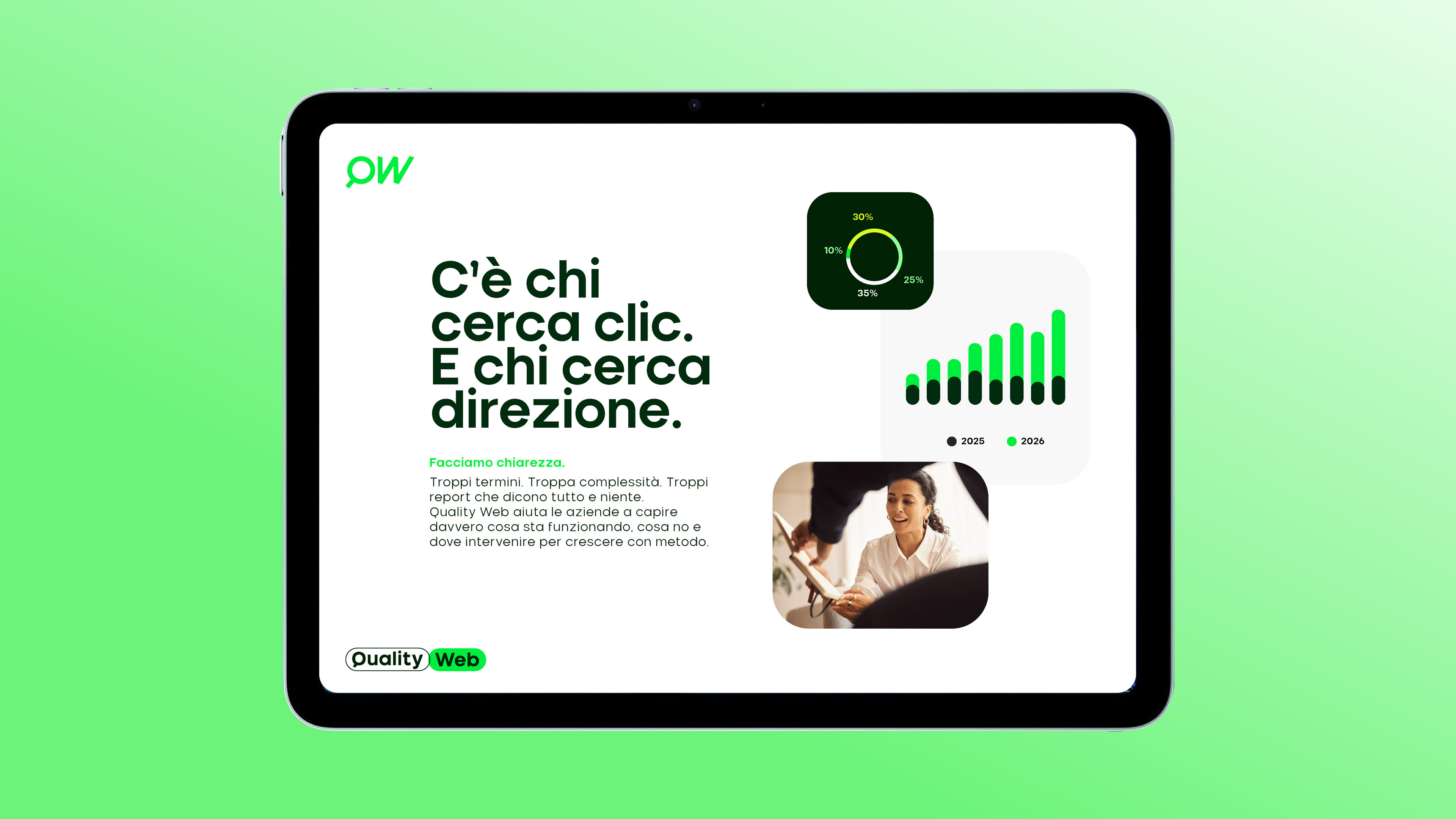
A bold palette of vibrant greens was designed to break away from the predictable visual language of performance marketing.
Flat colours and controlled gradients create a system that feels fresh, distinctive and built to get noticed.
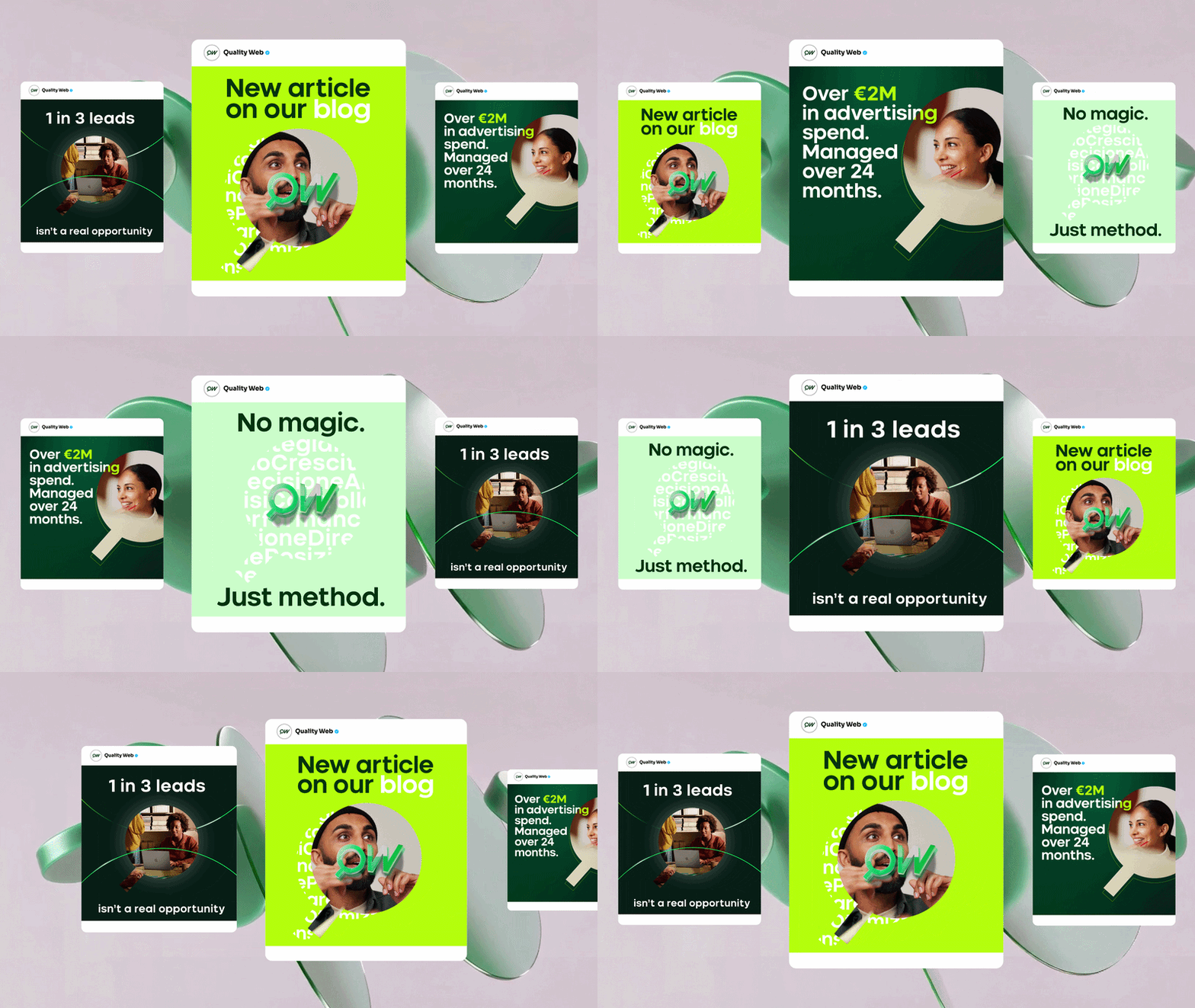


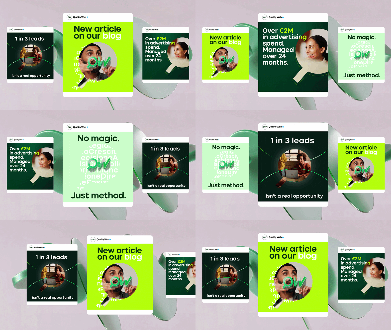


Bright, energetic and dynamic, the identity reflects the spirit of Quality Web itself: direct, curious and full of momentum. A deliberate move away from the cold, generic codes of the category and towards a brand that feels as alive as the team behind it.
Thanks Loris, Mario and the whole team for your trust!